Curtis Harris
  • Home
  • Blog
  • Resume

Dynamic Date Parameters using the Tableau JavaScript API

4/12/2016

2 Comments

 
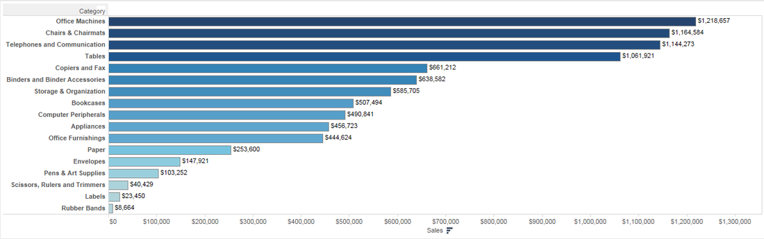
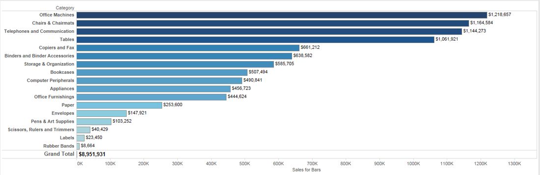
Tableau has a wide variety of date filtering options: ranges of dates, discrete dates, relative dates, and so on. There is another option that is very easy to implement, but can get killed due to the lack of dynamic parameters. This method involves creating two date parameters, a start and end date, and creating a conditional filter by putting your date field in between the two parameters. 

Example

Picture
Picture
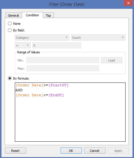
I for one am a big fan of this method as I think the parameter control for dates is very easy to use. This method often gets killed once the user realizes that the end date doesn't update to today's date, or when the publisher realizes she/he would have to update the current value of the EndDT parameter to keep up with user demand. 

Enter JavaScript API

Picture
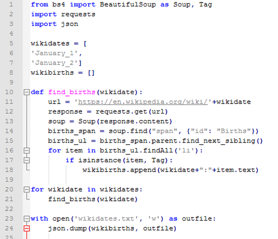
I'm quickly realizing that there are very few common Tableau problems that the JavaScript API can't solve. My coworker Chris Keates (@CDKeates) had a light bulb moment yesterday and quickly implemented a solution that automatically updates a date parameter. Here is a whopping 31 lines of code (less if you take out spaces), that anyone could implement with zero coding experience. All we are doing is changing the EndDT parameter to today's date using new Date(), and then refreshing the viz.


<html>

<head>

<script type="text/javascript" src="http://public.tableausoftware.com/javascripts/api/tableau_v8.debug.js"></script>

</head>

<body>
    <div id='viz'></div>
</body>

<script>

window.onload=function() {
    var vizDiv = document.getElementById('viz');
    var vizURL = "https://public.tableau.com/views/DynamicParameterExample/Overview?:embed=y&:display_count=yes&:showVizHome=no";
    var options = {
        onFirstInteractive: function() {
            workbook = viz.getWorkbook();
            workbook.changeParameterValueAsync('EndDT', new Date()); //Finds the parameter named EndDT and changes the current value to today's date using new Date()
            viz.refreshDataAsync(); //Refresh the data
            //That's it! Now you have a dynamic EndDT parameter that always updates to the current date!
        }
    };
viz = new tableauSoftware.Viz(vizDiv, vizURL, options);
};

</script>    

</html>

It really is that easy.
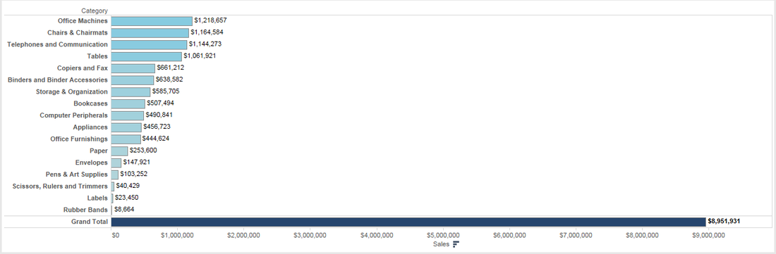
dynamicdateparameter.html
File Size: 0 kb
File Type: html
Download File

2 Comments

Querying Tableau's postgres database via Python

4/4/2016

0 Comments

 
As anyone who has read my blog knows, I really enjoy playing with Python. We have been trying to build some different Tableau Server solutions at work in recent months, and we came to a point where we needed to query the Postrges database in a Python application. The code I am sharing is by no means perfect, and only scrapes the surface of the possibilities, but it should be a decent precursor for how to get started. 

#python script

​import psycopg2

top_n_views = 20 #define top n views to get

urls = [] #define empty list to house urls for all views on the server

#connect to Tableau Server's PostgreSQL database 
conn = psycopg2.connect("dbname='workgroup' user='readonly' host='TabserverIpAddress' port='8060' password='p@ssword'")

#define cursor for PostgreSQL connection
cur = conn.cursor()

#SELECT statement to find top n view URLs
cur.execute("""SELECT 'http://TabServerUrl/#/views/' || view_url FROM _views JOIN _views_stats ON _views.id = _views_stats.views_id ORDER BY _views_stats.nviews desc limit """ + str(top_n_views))

#store results from SELECT
rows = cur.fetchall()

#send rows to urls list
for row in rows: #for every row stored in "rows"
    urls.append(row[0]) #append to the empty list named "urls"

print urls
tabserver.py
File Size: 0 kb
File Type: py
Download File

Output
Picture
0 Comments

Resetting Parameters with the JavaScript API

3/7/2016

1 Comment

 
If the viz below does not load, please click here.

Recently I came upon a need to be able to reset many parameters to their default value, without resetting any filters that have already been applied. Of course this can be accomplished a couple of different ways: pausing the dashboard and resetting each parameter manually or resetting each parameter one by one with dashboard updates in between. Neither of these options are satisfactory. You could also reset the dashboard to its published state, but that breaks the requirement for not resetting filters.

I'll note that this is a use case that would rarely be brought up, but there are a few instances where I think it would be useful. This demo will cover the second bullet point..
  • When using parameters to weight/rank measures
  • When using parameters to group together dimensions for comparative purposes
  • When a custom view is saved for specific users with many filters applied, but parameters still require adjustment for analytic purposes

On the left you should see a Tableau dashboard with two buttons above it. These buttons were created using CSS and are being controlled using Tableau's JavaScript API. The exact code used to create this application is on the right hand side. Normally I wouldn't embed CSS and JavaScript right into the HTML, but this blog required all the code to be in one file... oh well. 

This dashboard covers all of the requirements mentioned in the initial paragraph. One can adjust the filters in the top left corner, turn on/off parameters to control which groups are added to the lines in the line chart, and reset all parameters to their default value without reverting the filters. Pretty cool huh?

I'm hoping that the code is fairly self explanatory as I don't have enough time to dive into every line... feel free to ask questions if not! Here are a few basics..
  • The style section is completely optional.. I just happen to like ghost buttons. If you omit the style, you would still be able to create buttons that perform Tableau functions, they will just look like they came from Windows 95.
  • If you do choose to use CSS to create nicer looking buttons, you can actually float them anywhere you would like on the screen, including on top of the viz. This would almost create the illusion of a floating dashboard object.
  • The link to the Tableau debug file will change if you want to deploy something like this on your own Tableau Server and depending on which version of Server you are using.
  • You can see that the button definitions have an onclick action that refers to a JavaScript function defined later in the code which resets our blue or orange parameters. 
  • Also note that any function you can create using the JavaScript API could be weaponized using custom buttons. In theory.. you are creating a custom toolbar with functions that the built-in toolbar lacks.
  • Download the workbook to see the setup of the dashboard, parameters, and chart. 
Reset Blue Group Reset Orange Group
<html>
<head>
<title>Shipping Cost Configurator</title>
<script type="text/javascript" src="http://public.tableausoftware.com/javascripts/api/tableau_v8.debug.js"></script>
<style media="screen" type="text/css">

.ghost-button-border-color-blue {
 font-family: 'Segoe UI';
 font-size: 15px;
 display: inline-block;
 width: 155px;
 padding: 13.5px;
 color: #1f77b4;
 border: 3px solid #aec7e8;
 text-align: center;
 outline: none;
 width: auto;
 text-decoration: none;
 transition: border-color 0.3s ease-out,
 color 0.3s ease-out;
}
.ghost-button-border-color-blue:hover,
.ghost-button-border-color-blue:active {
 color: #1f77b4;
 border-color: #1f77b4;
 transition: border-color 0.4s ease-in,
 color 0.4s ease-in;
} 

.ghost-button-border-color-orange {
 font-family: 'Segoe UI';
 font-size: 15px;
 display: inline-block;
 width: 155px;
 padding: 13.5px;
 color: #ff7f0e;
 border: 3px solid #ffbb78;
 text-align: center;
 outline: none;
 width: auto;
 text-decoration: none;
 transition: border-color 0.3s ease-out,
 color 0.3s ease-out;
}
.ghost-button-border-color-orange:hover,
.ghost-button-border-color-orange:active {
 color: #ff7f0e;
 border-color: #ff7f0e;
 transition: border-color 0.4s ease-in,
 color 0.4s ease-in;
} 

</style>

</head>
<body>
<a class="ghost-button-border-color-blue" onclick="resetAGroup()">Reset Blue Group  </a> 
<a class="ghost-button-border-color-orange" onclick="resetBGroup()">Reset Orange Group</a> 
<div id='viz'></div>                                                                
</body>

<script>
window.onload=function() {
var vizDiv = document.getElementById('viz');
var vizURL = "https://public.tableau.com/views/ShippingCostConfigurator_0/ShippingCostConfigurator?:embed=y&:display_count=yes&:showVizHome=no";
var options = {
hideToolbar: true
};
viz = new tableauSoftware.Viz(vizDiv, vizURL, options);
};

function resetAGroup() { 
workbook = viz.getWorkbook();
workbook.changeParameterValueAsync('AJumboBox',  'Off');
workbook.changeParameterValueAsync('AJumboDrum', 'Off');
workbook.changeParameterValueAsync('ALargeBox',  'Off');
workbook.changeParameterValueAsync('AMediumBox', 'Off');
workbook.changeParameterValueAsync('ASmallBox',  'Off');
workbook.changeParameterValueAsync('ASmallPack', 'Off');
workbook.changeParameterValueAsync('AWrapBag',   'Off');
viz.refreshDataAsync();
};

function resetBGroup() { 
workbook = viz.getWorkbook();
workbook.changeParameterValueAsync('BJumboBox',  'Off');
workbook.changeParameterValueAsync('BJumboDrum', 'Off');
workbook.changeParameterValueAsync('BLargeBox',  'Off');
workbook.changeParameterValueAsync('BMediumBox', 'Off');
workbook.changeParameterValueAsync('BSmallBox',  'Off');
workbook.changeParameterValueAsync('BSmallPack', 'Off');
workbook.changeParameterValueAsync('BWrapBag',   'Off'); 
viz.refreshDataAsync();
};
</script> 

</html>
1 Comment

Iron Viz - Significant Births throughout history

3/20/2015

0 Comments

 
March is traditionally the first seed challenge into Tableau's Iron Viz competition that takes place at the annual conference. If you have ever played with Tableau, I would encourage you to enter the competition here. No matter your skill level, competing with some of the best Tableau artists will challenge you to push your own abilities to the limit. I didn't enter any of the seed competitions last year because I didn't think I could win. This year I've been more involved with the community than ever before, and realize that this is more about having fun with your peers than it is about winning.

Without further ado, my finished entry is below. You can click on the image to interact with it and see who Wikipedia considers to be a "significant birth" on your birthday.. or pretty much any day from the last 200 years!
Picture


Scraping data from 365 wikipedia pages in under 5 minutes

Wikipedia is a world of data.. maybe too much data to digest! When entering this contest I didn't know what topic to choose, but I know I wanted something with a lot of data to produce a visually appealing viz. After poking around, I stumbled on a Wikipedia page for a specific day of the year: en.wikipedia.org/en/wiki/January_1. For every day of the year, Wikipedia has a dedicated page. As an added bonus, every single page has a nice list of significant events, births and deaths! This was great news except for the fact that the data didn't paste exactly how I wanted it, and even if it did, I was going to have to do this over 350 times! 

enter python

I took this challenge as a means to start learning Python. After Googling many different solutions, I happened upon one that looks very similar to my problem and was able to come up with some fairly simple code that scraped all 365 Wikipedia pages in under 5 minutes!! (Leap day was left out due to incorrect formatting)

If you aren't interested in my rough description of how the code works, just download the Python to the right and try it for yourself!

Download the code

ironvizbirths.py
File Size: 5 kb
File Type: py
Download File

how the code works

To the right is a condensed version of the code I used to pull this data. The only thing it is missing is the list of dates in their entirety. I am going to try my hand at explaining what this is doing line by line.. I hope it is valuable! I understand if you don't read the wall of words below, it is more to help me try and explain what I did. Nothing is learned if you simply run borrowed code without trying to understand what it is doing. 

  1. Importing the BeautifulSoup package - BeautifulSoup is used for parsing HTML documents
  2. Importing the requests package - Requests is used to get information from specified URLs.
  3. Importing the json package - JSON is used to handle JSON data.. I don't really understand it, but do know enough to translate the result set.
  4. The code begins by defining a list of strings called "wikidates", but you could name this whatever you like. In this instance we want to use the syntax at the end of the Wikipedia url MonthName_DayNumber or January_1. We are defining this list because we want Python to loop through each day of the year and gather data automatically. If we didn't do this, there would be no advantage to using Python over copy and paste.
  5. The next step is to create an empty data frame named "wikibirths". We will get to why we did this on line 20 of the code.
  6. Now we start to define our function.. this is the working area of the code. For this project I created a function called "find_births" that accepts a called "wikidate" (the dates from our "wikidates" list). 
  7. Tell the function what URL to get data from, with the appended date as a URL parameter (a little Tableau-ish)
  8. response = requests.get(url) - this is simply defining a set of data called response that is made up of all the components of a web page. Think of looking at a page and pressing Control+U.
  9. soup = Soup(response.content) - taking that same data from the previous line and adding it to your soup. (no clue, but it works)
  10. births_span = soup.find("span", {"id": "Births"}) - this is where the real magic starts. BeautifulSoup is analyzing the response content and looking for the precise spot where the Births section starts in the page source. 
  11. The following few lines of code start looking for each list item (li) in the Births section of the page, strips out the html, transform it in to plain text, and sends the complete list to our empty data frame named "wikibirths". I told you I would get back to that. 
  12. Now that our function is complete, we want to tell Python to do this for every date we have defined. Line 20 of the code says, "Take a string from the wikidates data set and send it to the find_births function. When you are done running the function with that wikidate, start over with the next, and so on and so on until the list is complete. 
  13. As an added bonus, you can see I concatenated my wikidate with the response text. This gave me an extra element of data that copying and pasting couldn't accomplish.
  14. Lastly I am creating a file named wikidates.txt and sending the results from step 12 to that file in a JSON format. From there it is as easy as running the file through http://konklone.io/json/ and sending to Excel.
Picture

Building the viz

This viz is an example of taking fairly simple data and turning it into something personal and interesting. The Wikipedia scraping churned out 138,133 rows of significant births, dating back to BC times.. dates that Tableau's continuous axes can't even recognize! I went through many different iterations of chart types, color schemes, and dashboard designs before settling on my final design, and I'm really quite happy with how it turned out. Most of the dashboard is out of the box Tableau stuff, but there are a few neat tricks that I tried to fold in that you might not have seen before. So instead of going through my entire design, I just want to explain two specific elements of the dashboard.

Moving color legends

Recently the Wall Street Journal put out of viz that garnered a lot of buzz in the community that was about battling infectious diseases (find it here). While most viewers probably just looked at the heat maps, there was something hiding in there that I wanted to try in Tableau. Notice as you move over a mark in their heat map, there is an indicator at the bottom of where that value lands on the color legend. This little triangle moves along as you hover over any value in the heat map, I think that is something that has value and is something different for Tableau to try and accomplish. While I couldn't get the motion to be quite as responsive as WSJ, I was able to replicate that action using Tableau. Originally I had this action turned on for my heat map, but the hover action response was too slow so I axed it. The indicator now only shows you where you are at relative to the birth date you enter.
Picture
Picture
Building this took two worksheets. First I wanted to build my own color legend instead of using Tableau's color legend. The legend is simply showing distinct birth counts for all days in the data set, the minimum being 1 and the most significant births for any given day turned out to be 23. I needed room to the left and right so the axis was fixed to -1 and 25. 

Now I wanted to build my interactive marker to highlight your relation to the rest of the dates. To make this work I needed to limit my view to a single mark, the number of births on your birthday. To do this I have a conditional date filter that limits the range to just your birthday, as declared by the dashboard's date parameter. Now that the data is limited to your birthday, I can just place Number of Records on the Columns shelf and I have my single mark. Adjust this axis accordingly to match your custom color legend, and you triangle mark should be working. 

To implement this into my dashboard, I floated the triangle sheet on top of the color legend sheet, and turned off the title for the color legend. Doing this produces the effect that it is one worksheet doing all the work. Note.. you might be able to accomplish this using one sheet and a dual axis.. I just didn't get that far. 

If you wanted to make this more interactive like the WSJ version, you could replace the conditional date filter with a hover action from your dashboard. By doing this you will get the triangle mark to slide along the axis.. just note that it may not perform as well as you would like it to.
Picture
Picture

Action filters and conditional filters working together

Please please if you have a better way to do this let me know!!! 

When you open the dashboard, I want you to enter your birthday to personalize your experience. Entering your birthday will show you data about your birth year, birth month, birthday, and who Wikipedia has listed as a significant birth on that day. All of this is controlled by the birthday parameter and conditional filters. I didn't want to limit a viewer to just seeing the significant births on their birthday.. so I needed a way to have the birth list be controlled by the birthday parameter or by the hover action embedded into the heat map. For the life of me, I could not figure out how to tell one sheet to take the conditional filter first then override that condition by use of the hover action.

My solution involves floating two sheets on top of each other.. one controlled by the conditional filter and one controlled by the hover action. The image on the left is a sheet controlled by the birthday parameter using a conditional filter. The image on the right is an exact replica of that sheet, except it is controlled by a hover action from the heat map. The dashboard action is configured to send the date from the heat map to the worksheet, and empty the table when the selection is cleared. By floating the action controlled sheet on top of the condition controlled sheet, I get the functionality that I desire. When a user enters a new birthday, the results float to the top and the birth list is exactly relevant to the user. If that user wants to look at other significant births in their birth year, they are now free to do so as activating the action brings the new results to the front. 
Picture
Picture
Picture
0 Comments

Tableau Quick Tricks - Building a better bar chart

1/5/2015

16 Comments


Tableau Blog Reality check for 2015

Happy New Year to everyone, and especially to those in the Tableau Community! I want to take a moment to thank everyone who has inspired me to start this blog, and for the continued inspiration to keep going! With the end of year goals, tasks and projects wrapping up, I haven't had much time to dedicate to my blog and could feel the luster starting to fade. Then I read a blog post by @ChrisLuv that helped inspire me to keep this thing going into 2015. Give his post a read if you are looking for a little general blogging inspiration. 

For my first blog of 2015 I wanted to share some of my tips on blogging for those new to the #tableau community http://t.co/XovwlxgRgl

— Chris Love (@ChrisLuv) January 2, 2015

Onto the Tableau stuff

In 2015, I want to focus my blogging efforts toward learning experiences rather than just posting a cool viz. I want to start out 2015 with a problem I often see... people take Tableau for what it is out of the box. 

Many a time I have seen someone build a perfectly nice bar chart, only to have it spoiled by turning on grand totals and having the value of the total skew the rest of the chart. Hell, I have done this myself plenty of times!! Up until recently, I haven't ever given this a second thought and said to myself, "Well if that is how Tableau wants it, then I guess that's what I've got!" Anyone looking at getting into Tableau, or anyone who is fully immersed into Tableau, should never accept what is first given. There is always a solution!
Example A 

A simple categorical bar chart with grand totals turned off
Picture
Example B

Here is what happens when we show column grand totals... I'm almost certain this isn't how most would want to display their data.
Picture
Like I said above.. until recently I had no idea how to solve this puzzle. Come to find out the solution is quite simple, and it all is held within the SIZE() function. With a simple calculated field, we will have the ability to turn on column grand totals without a messy bar chart, without merging sheets on a dashboard, and without a difficult calculation to create it!

Calculated field - Sales for Bars
Picture
Why SIZE()?

Tableau's SIZE() function does a simple task, it counts the rows in a window. By saying "IF SIZE() = 1 THEN 0" we are simply overriding the Sales field to a 0 when there is only one row in the window.. see where I am going with this? Turning on totals creates a separate window in your view that only has one row. We can provide actual sales for Category but the totals will now be set to zero and will not create a bar that is going to skew our entire chart. 
Picture
The Finish Line

So what now? We have created a calculated field, but I'm still not sure what to do with it. The final solution is simple and can be done in just a few drag and drop actions. 
  1. Replace SUM(Sales) with our calculated field "Sales for Bars" on the columns shelf
  2. Replace SUM(Sales) with our calculated field "Sales for Bars" for color on the marks card
  3. Add SUM(Sales) for Label on the marks card
Voila! We now have an output worth sharing with our customers. Our colors and bars are now in relation to categories only and do not get skewed by the total.. and we get to have our cake and eat it too by still displaying the grand total at the bottom of the bars. 
Picture
Please feel free to get in touch with me if you have any additional thoughts or questions on this solution! The Tableau Public workbook is available for viewing/download below if you want to play with the solution yourself!
Learn About Tableau
16 Comments
    Tweets by @Harris7Curtis

    Archives

    May 2016
    April 2016
    March 2016
    October 2015
    July 2015
    March 2015
    February 2015
    January 2015
    November 2014
    October 2014
    September 2014

    RSS Feed

Powered by Create your own unique website with customizable templates.