Tableau Blog Reality check for 2015
Happy New Year to everyone, and especially to those in the Tableau Community! I want to take a moment to thank everyone who has inspired me to start this blog, and for the continued inspiration to keep going! With the end of year goals, tasks and projects wrapping up, I haven't had much time to dedicate to my blog and could feel the luster starting to fade. Then I read a blog post by @ChrisLuv that helped inspire me to keep this thing going into 2015. Give his post a read if you are looking for a little general blogging inspiration.
For my first blog of 2015 I wanted to share some of my tips on blogging for those new to the #tableau community http://t.co/XovwlxgRgl
— Chris Love (@ChrisLuv) January 2, 2015 Onto the Tableau stuff
In 2015, I want to focus my blogging efforts toward learning experiences rather than just posting a cool viz. I want to start out 2015 with a problem I often see... people take Tableau for what it is out of the box.
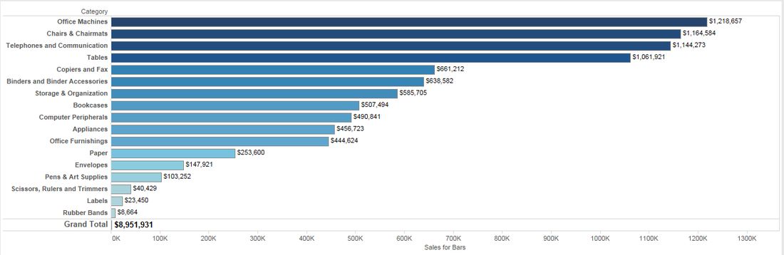
Many a time I have seen someone build a perfectly nice bar chart, only to have it spoiled by turning on grand totals and having the value of the total skew the rest of the chart. Hell, I have done this myself plenty of times!! Up until recently, I haven't ever given this a second thought and said to myself, "Well if that is how Tableau wants it, then I guess that's what I've got!" Anyone looking at getting into Tableau, or anyone who is fully immersed into Tableau, should never accept what is first given. There is always a solution!
Many a time I have seen someone build a perfectly nice bar chart, only to have it spoiled by turning on grand totals and having the value of the total skew the rest of the chart. Hell, I have done this myself plenty of times!! Up until recently, I haven't ever given this a second thought and said to myself, "Well if that is how Tableau wants it, then I guess that's what I've got!" Anyone looking at getting into Tableau, or anyone who is fully immersed into Tableau, should never accept what is first given. There is always a solution!
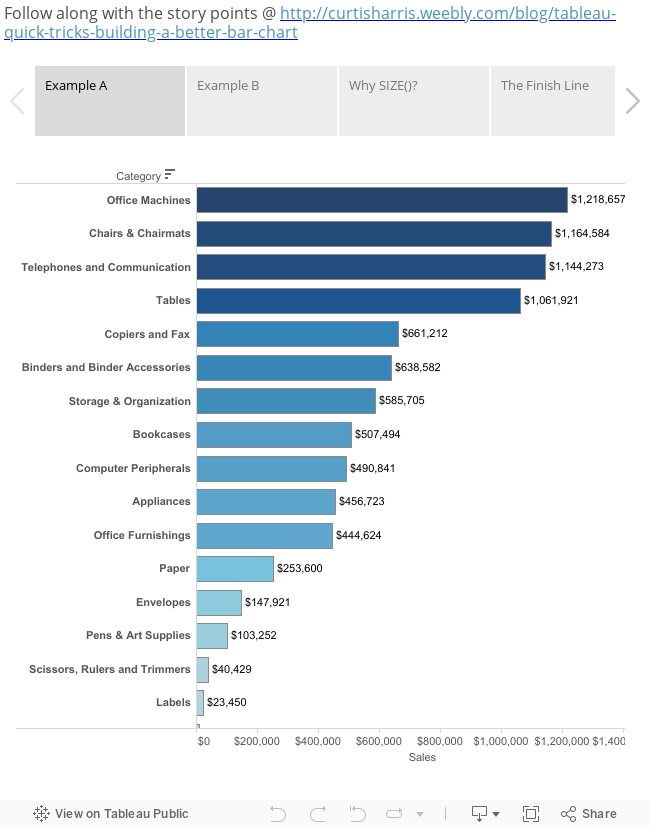
Example A
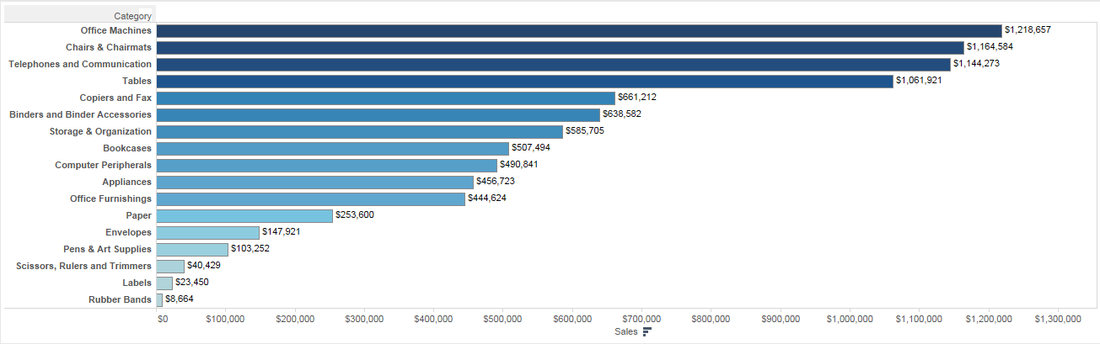
A simple categorical bar chart with grand totals turned off
A simple categorical bar chart with grand totals turned off
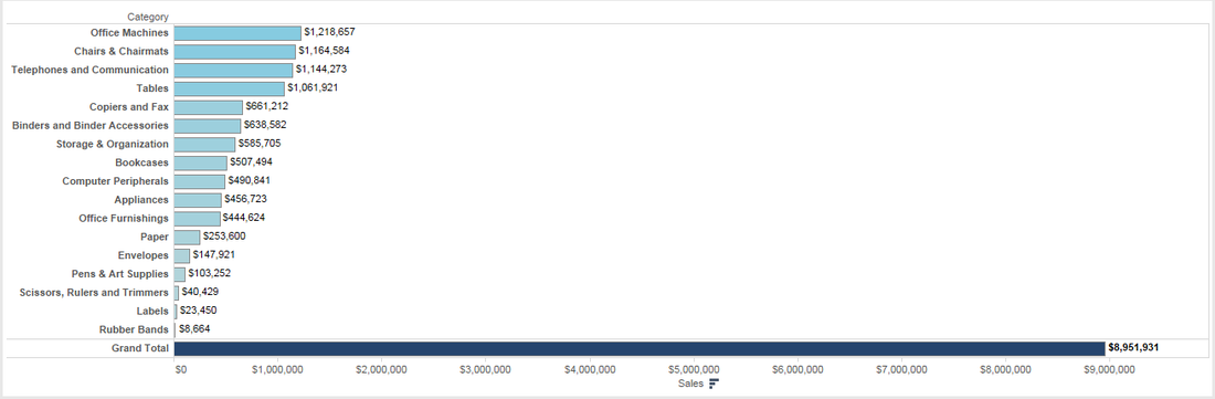
Example B
Here is what happens when we show column grand totals... I'm almost certain this isn't how most would want to display their data.
Here is what happens when we show column grand totals... I'm almost certain this isn't how most would want to display their data.
Like I said above.. until recently I had no idea how to solve this puzzle. Come to find out the solution is quite simple, and it all is held within the SIZE() function. With a simple calculated field, we will have the ability to turn on column grand totals without a messy bar chart, without merging sheets on a dashboard, and without a difficult calculation to create it!
Calculated field - Sales for Bars
Calculated field - Sales for Bars
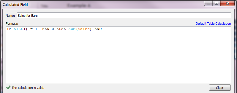
Why SIZE()?
Tableau's SIZE() function does a simple task, it counts the rows in a window. By saying "IF SIZE() = 1 THEN 0" we are simply overriding the Sales field to a 0 when there is only one row in the window.. see where I am going with this? Turning on totals creates a separate window in your view that only has one row. We can provide actual sales for Category but the totals will now be set to zero and will not create a bar that is going to skew our entire chart.
Tableau's SIZE() function does a simple task, it counts the rows in a window. By saying "IF SIZE() = 1 THEN 0" we are simply overriding the Sales field to a 0 when there is only one row in the window.. see where I am going with this? Turning on totals creates a separate window in your view that only has one row. We can provide actual sales for Category but the totals will now be set to zero and will not create a bar that is going to skew our entire chart.
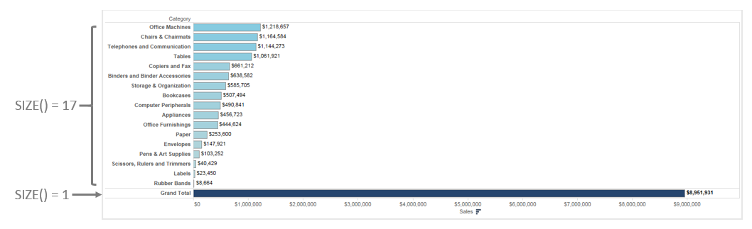
The Finish Line
So what now? We have created a calculated field, but I'm still not sure what to do with it. The final solution is simple and can be done in just a few drag and drop actions.
So what now? We have created a calculated field, but I'm still not sure what to do with it. The final solution is simple and can be done in just a few drag and drop actions.
- Replace SUM(Sales) with our calculated field "Sales for Bars" on the columns shelf
- Replace SUM(Sales) with our calculated field "Sales for Bars" for color on the marks card
- Add SUM(Sales) for Label on the marks card
Please feel free to get in touch with me if you have any additional thoughts or questions on this solution! The Tableau Public workbook is available for viewing/download below if you want to play with the solution yourself!
 RSS Feed
